I created a Wix to display my answers to the four evaluation questions:-
bryony-johnson.wix.com/a2evaluation


Digipak Editing
I used Photoshop to edit the pictures for my digipak. I experimented with lots of different pictures and editing techniques in order to find which one worked best.
.jpg) I firstly edited a picture in black and white as this is used on Ariana Grande's album art.However I did not feel like this worked well for the song I had chosen. I therefore experimented with overlaying pink layers as I felt like this would connote love.
I firstly edited a picture in black and white as this is used on Ariana Grande's album art.However I did not feel like this worked well for the song I had chosen. I therefore experimented with overlaying pink layers as I felt like this would connote love.
From conducting research into other digipaks, I discovered that the artists appeared to have flawless skin due to being edited. I therefore eliminated any visible blemishes that appeared in the photograph.


 I decided to use this font as it isn't too over the top, yet still fits in with the theme of the song and relates to the artist.
I firstly edited a picture in black and white as this is used on Ariana Grande's album art.However I did not feel like this worked well for the song I had chosen. I therefore experimented with overlaying pink layers as I felt like this would connote love.From conducting research into other digipaks, I discovered that the artists appeared to have flawless skin due to being edited. I therefore eliminated any visible blemishes that appeared in the photograph.
 |
| Before |
 |
| After |
I then decided to look at different fonts to use on the cover of the album. I chose fonts which looked girly as they relate to my chosen artist, Ariana Grande. I also looked at fonts which had hearts as this relates to 'love' which is the theme of the song.
Digipak Ideas
I drew out a draft of what I wanted my digipak to look like. The top three images would be on the outside, and the bottom three would be on the inside. I aimed to follow the conventions of real digipaks by using six panels. I also decided to include multiple images of the artist.

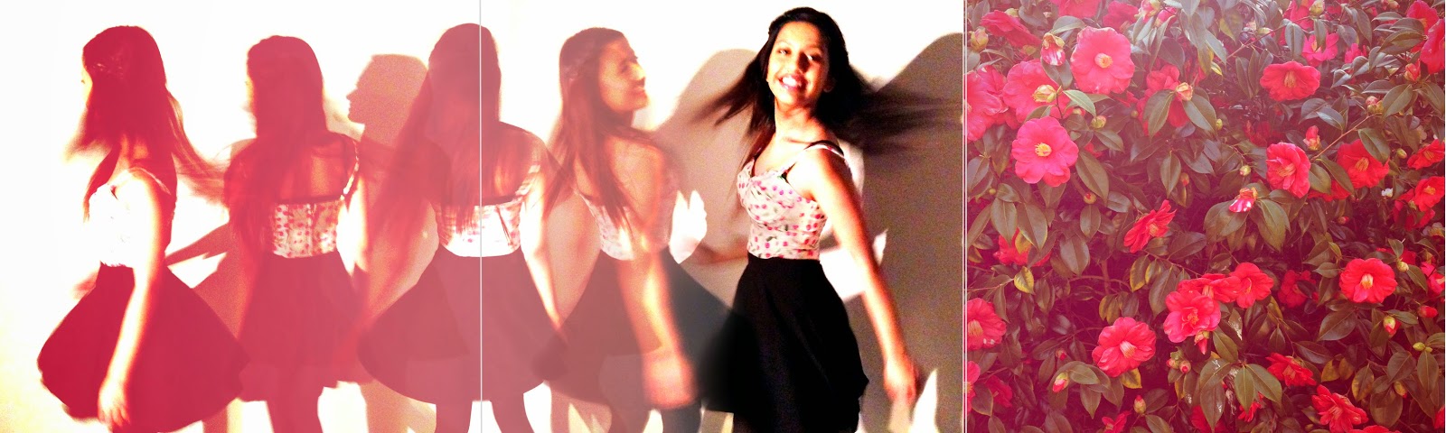
I embedded below the contact sheet from when I took my pictures. I wanted to connote Ariana Grande's fun and girly personality.

Magazine Advert Research
This post shows the research I did into magazine advertisements for new albums. From this task, I have learnt that these advertisements usually use the same imaging as the original album art. They also use the same or a similar font scheme to the album cover. When making the advertisement for my digipak, I will use these conventions. Moreover, I will include the name of a couple of tracks from the album, the logo of the record company, and the artist's website.
Digipak Research
A digipak is a type of packaging that comes with a CD, usually intended for a special purpose, for example, a limited edition.
Talk That Talk - Rihanna

Teenage Dream - Katy Perry

The second digipak I researched is for Katy Perry's 'Teenage Dream' album. This also has six panels and large pictures of the artist. It subverts the usual convention of an album cover as it does not show the title of the album or the artist's name. This draws emphasis to Perry herself. Similarly to Rihanna's digipak, it denotes a parental advisory label. The track list is shown of the back cover of the album.
The images on the outside of the digipak denote Perry laying naked on a pink cloud. The use of a cloud relates to the title of the album as it connotes a "dream". Katy Perry being naked also gives her sex appeal, similary to Rihanna. Her skin appears to be flawless which suggests that she has been airbrushed using Photoshop. This relates to Naomi Wolf's theory (1991) that women are objects of sexual desire and must be beautiful in order to be successful.
The track list is written in large, red bubble writing which connotes candy. This relates to Perry's theme of album as the CDs also look like sweets and the top image denotes cakes.
Talk That Talk - Rihanna
The first digipak I've researched is Rihanna's 'Talk That That' album. It follows the usual conventions as it has six panels, in order to show the buyer more content, and features large pictures of the artist. A parental advisory label can be seen on the cover so that the consumers are aware of the "explicit content". This is useful as it means the product won't be sold to the wrong kind of audience, e.g. small children. A track list and the production company can also be seen on the packaging.
Two of the images denote Rihanna with her mouth blowing out smoke. This relates to Rihanna's edgy personality. Moreover, her mouth being open relates to the title of the album, 'Talk That Talk'. Another photograph shows Rihanna sitting with her legs open. Furthermore her legs are made into a focal point by the use of lighting. This has sexual connotations, which Rihanna is quite well known for. This is also quite conventional of the R&B genre. The images have been edited in black and white, with high contrast. This again emphasises Rihanna's edgy style. The typography used is serif font, which is quite sophisticated and will therefore appeal to a more mature audience.
Teenage Dream - Katy Perry
The second digipak I researched is for Katy Perry's 'Teenage Dream' album. This also has six panels and large pictures of the artist. It subverts the usual convention of an album cover as it does not show the title of the album or the artist's name. This draws emphasis to Perry herself. Similarly to Rihanna's digipak, it denotes a parental advisory label. The track list is shown of the back cover of the album.
The images on the outside of the digipak denote Perry laying naked on a pink cloud. The use of a cloud relates to the title of the album as it connotes a "dream". Katy Perry being naked also gives her sex appeal, similary to Rihanna. Her skin appears to be flawless which suggests that she has been airbrushed using Photoshop. This relates to Naomi Wolf's theory (1991) that women are objects of sexual desire and must be beautiful in order to be successful.
The track list is written in large, red bubble writing which connotes candy. This relates to Perry's theme of album as the CDs also look like sweets and the top image denotes cakes.
Filming Schedule and Health and Safety Form
I created a filming schedule to help organise when I would be filming certain scenes. This was useful as it hopefully means I will not miss out on filming any scenes for my video.
I also created a health and safety form to identify any possible hazards. This task was essential as it will help reduce any incidents from occurring.
I also created a health and safety form to identify any possible hazards. This task was essential as it will help reduce any incidents from occurring.
Subscribe to:
Posts (Atom)